
Learn
Use Cases
How teams use ConversionWax
Guides
Step-by-step setup and strategy
Playbook
Proven plays for every industry
Compare
How we stack up against others
Blog
Personalization tips and platform updates
Help Center
Docs, setup guides, and support
Featured playbook
Ecommerce Personalization Playbook
Geo-targeted offers, BFCM windows, device-specific layouts - copy-paste plays that run themselves.
Optimized Images
Auto-resize for any device
Video Support
Personalized video content
Scheduled Updates
Time-based content automation
By role
Ecommerce Operators
Geo-offers, BFCM, device layouts
Growth Marketers
Campaign pages, UTM matching, A/B
Digital Agencies
Multi-site, version control, team access
New in the platform
AI Image Generation
Generate campaign visuals from a prompt. Saves to your asset library.
Learn more →12 Ecommerce Personalization Examples That Convert

Sephora's app remembers the last foundation shade you tried in-store and surfaces it when you open the product page at home. That single piece of personalization - "your shade: 310 Honey" displayed above the Add to Cart button - removes the biggest purchase blocker in cosmetics: uncertainty about color match. It works so well that Sephora attributes double-digit conversion lifts to their Color IQ personalization alone.
That is what good ecommerce personalization examples look like. Not a popup that says "Welcome back, Sarah!" but a specific, contextual detail that removes friction between browsing and buying. The best online stores layer these details across product pages, homepages, checkout flows, and visual assets to build an experience that feels tailored without feeling intrusive.
This guide breaks down 12 ecommerce personalization examples across four categories, with enough implementation detail to actually replicate them. Some require years of data infrastructure. Others you can ship this week with a single script tag.
Product Page Personalization Examples
Product pages are where purchase decisions happen. Personalization here directly impacts conversion rate because it reduces the mental work a shopper has to do before clicking "buy."
1. Amazon's "Frequently Bought Together" and Browsing-History Recommendations
Amazon's recommendation engine generates roughly 35% of their total revenue. The "Frequently Bought Together" module on every product page uses collaborative filtering - essentially looking at what other customers purchased alongside this item - to suggest bundles that make logical sense. Buy a DSLR camera, and the page surfaces a memory card, a camera bag, and a lens cleaning kit. The total price is shown pre-calculated, and everything adds to cart with one click.
What makes this work is not the algorithm itself but the frictionless execution. Amazon does not show a generic "you might also like" carousel. They show a curated bundle that answers the question "what else do I need to use this product?" with a combined price and a single button. That specificity is what separates high-performing product recommendations from noise.
The browsing-history row ("Inspired by your shopping trends") works on a different vector. It surfaces items related to past browsing sessions, creating continuity across visits. A shopper who looked at standing desks last Tuesday sees standing desk accessories when they come back on Friday for something unrelated. That subtle persistence keeps relevant products in view without demanding the shopper remember where they left off.
2. ASOS Size-Specific Model Imagery
ASOS shows product photos on models of different sizes based on which size the shopper selects. Choose a UK size 6 and you see the garment on a size-6 model. Choose a UK size 14 and you see it on a size-14 model. The clothes are the same. The model changes.
This does two things simultaneously. First, it gives shoppers a realistic visual reference for how the item will look on a body similar to theirs, which directly attacks the "will this actually look good on me?" objection that drives returns in online fashion. Second, it signals inclusivity without needing a banner that says "we are inclusive." The personalization is the inclusivity.
ASOS reported a measurable reduction in return rates after rolling this out, which matters because returns are the margin killer in online fashion. Every return that does not happen is pure recovered profit. The takeaway: personalization that reduces post-purchase regret is just as valuable as personalization that increases add-to-cart rates.
3. Nike's Geo-Specific Product Launches
Nike runs regional product drops through the SNKRS app, releasing specific colorways and collaborations only to shoppers in certain cities. A limited Jordan colorway might drop exclusively in Chicago, while a skateboarding collaboration hits only LA and New York. The product page itself is personalized by location - if you are outside the drop zone, you see a waitlist instead of a buy button.
This is personalization used as a scarcity mechanism. Geo-limiting the availability creates regional hype, drives social sharing ("Chicago exclusive drop just went live"), and turns a product launch into a local event. Nike reported that SNKRS app engagement is 3x higher during geo-targeted drops compared to global releases.
The broader lesson: showing visitors different product availability, imagery, or calls to action based on their location does not require Nike's infrastructure. Any ecommerce store using geo targeting can surface "available for same-day delivery in your area" messaging or show regional product variants based on where the shopper is browsing from.
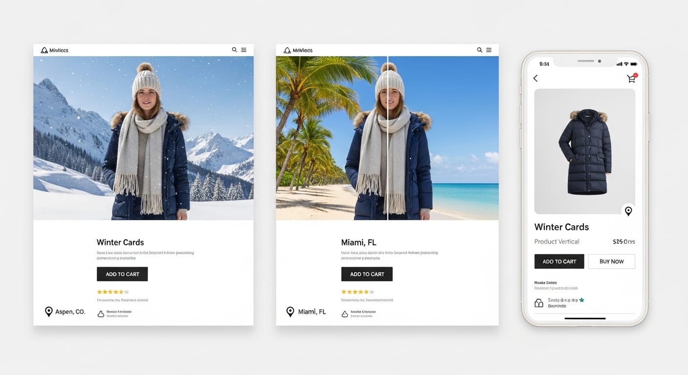
4. Climate-Appropriate Product Styling by Visitor Location
A fashion retailer selling a versatile jacket can show it styled completely differently depending on who is looking. A visitor from Minneapolis in January sees the jacket layered over a chunky knit sweater, paired with boots, photographed on a snowy street. A visitor from Austin in January sees the same jacket worn open over a t-shirt, paired with sneakers, photographed in bright sunlight.
This is not hypothetical - brands like Uniqlo and Zara have tested regional lifestyle photography and found that climate-matched styling images outperform generic studio shots by 15% to 25% on click-through rate. The product does not change. The context around it changes.
With ConversionWax's location-based image swapping, you can upload multiple lifestyle variants for the same product and define rules that match each variant to specific regions or climate zones. The swap happens before the page renders - no layout shift, no flicker. The visitor sees only the version that matches their world.
Homepage and Hero Personalization Examples
The homepage hero is the highest-impact piece of real estate on any ecommerce site. It is the first visual a visitor processes, and it shapes the emotional tone for the entire session. Personalizing it is the single highest-ROI change most stores can make.
5. Geo-Targeted Hero Banners With Local Imagery
An outdoor gear retailer showing the same mountain-lake hero image to every visitor is leaving engagement on the table. A shopper in Colorado already lives near mountains - that image feels generic to them. A shopper in Florida has never seen a mountain lake in person - the image feels aspirational but disconnected from their outdoor reality.
The fix is straightforward. Upload regional hero variants: a kayaker on a calm Florida inlet for Southeast visitors, a trail runner on red desert rock for Southwest visitors, a skier in fresh powder for Rocky Mountain visitors, a surfer at dawn for California visitors. Same brand, same messaging, different hero image matched to what "outdoor" actually means in each visitor's geography.
This is exactly what ConversionWax was built for. You upload your image variants, define location rules (country, region, state, or city), and the platform swaps the hero image in real time based on each visitor's IP. The implementation takes about 20 minutes for a basic location-targeted hero. No developer required.
Stores running geo-targeted heroes typically see 20% to 40% improvement in hero-to-scroll engagement and 8% to 15% lifts in downstream conversion on those pages.
6. Returning Visitor vs. New Visitor Hero Messaging
Nordstrom serves different homepage experiences to first-time visitors and returning customers. A new visitor sees a broad brand story - "Find your style" with a curated seasonal lookbook. A returning visitor sees a "Pick up where you left off" section with recently browsed categories and product tiles from their last session.
The logic is simple: a first-time visitor needs orientation. They do not know your brand, your product range, or your value proposition. They need a hero that answers "why should I shop here?" A returning visitor already knows the answers to those questions. They need a hero that answers "where was I?" and gets them back into the funnel as fast as possible.
Implementing this requires a session or cookie check to distinguish new vs. returning visitors, then serving different hero content based on that flag. The conversion impact is significant because you are eliminating redundancy - returning visitors skip the "discover our brand" pitch they have already absorbed and go straight to relevant products.
7. Campaign-Matched Landing Page Heroes Using UTM Parameters
A skincare brand runs three Facebook ad campaigns simultaneously: one featuring their vitamin C serum against a bright citrus backdrop, one featuring their retinol cream with a nighttime routine theme, and one featuring a bundle deal with both products. Each ad has a different visual identity and emotional hook.
All three ads link to the same landing page. But if every visitor sees the same generic hero when they arrive, the visual continuity breaks. The shopper who clicked an ad showing the vitamin C serum against bright citrus arrives and sees... a flat-lay of the entire product line. The emotional thread snaps. Bounce rate climbs.
UTM-based hero personalization fixes this by reading the campaign parameters in the URL and swapping the landing page hero to match the specific ad the visitor clicked. The vitamin C ad links to ?utm_campaign=vitc_serum and the hero shows the same citrus-backdrop imagery from the ad. The retinol ad links to ?utm_campaign=retinol_night and the hero shifts to the nighttime routine visual.
ConversionWax handles this with URL variable display rules. You define which UTM parameter values map to which banner variants, and the platform swaps the hero image instantly when the page loads. One landing page URL, multiple visual experiences, each matched to the ad that drove the click. Brands running campaign-matched heroes consistently report 25% to 50% improvement in ad-to-page conversion rates.
8. Seasonal Imagery Based on Visitor Location
A home decor brand in December faces a visual dilemma. Half their US traffic comes from regions where December means snow, fireplaces, and cozy interiors. The other half comes from places where December means 75 degrees and outdoor dining. Showing snowflake-themed hero imagery to a visitor in San Diego feels tone-deaf. Showing a sunny patio scene to a visitor in Vermont feels equally off.
Seasonal personalization by location solves this by matching hero imagery to the actual season and climate the visitor is experiencing. Vermont visitors see a cozy living room with a throw blanket and warm lighting. San Diego visitors see an outdoor patio with string lights and a table set for dinner. Both are "holiday" scenes, but they reflect different lived experiences.
This works for any product category with seasonal relevance: fashion (coats vs. sandals), food and beverage (hot drinks vs. cold drinks), fitness (indoor workouts vs. outdoor runs), automotive (snow tires vs. all-season). The key is that you are not guessing - you are using the visitor's actual location as a proxy for their current season and climate.
Checkout and Cart Personalization Examples
Cart and checkout personalization targets the most fragile moment in the buying process - the point where a shopper has expressed intent but has not committed yet. Every piece of friction here directly costs you revenue.
9. Location-Specific Shipping Estimates and Free Shipping Thresholds
Zappos shows estimated delivery dates based on the visitor's shipping address, and they show them early - on the product page, not buried in checkout. A shopper in the same state as the fulfillment center sees "Arrives by Thursday" while a shopper across the country sees "Arrives by Monday." Both pieces of information are useful because they set expectations before the shopper commits.
Some retailers take this further by personalizing the free shipping threshold message. If a shopper is $12 away from free shipping, the cart shows "Add $12 more for free shipping" with a suggested product that costs roughly $12. The suggestion is not random - it is pulled from the shopper's browsing history or from products commonly purchased alongside items already in the cart.
This combination of location-aware delivery estimates and smart threshold messaging reduces cart abandonment because it eliminates two of the top three reasons shoppers bail at checkout: unexpected shipping costs and unclear delivery timelines.
10. Currency and Payment Method Personalization by Region
ASOS automatically displays prices in the visitor's local currency and surfaces region-appropriate payment methods. A UK visitor sees prices in GBP with Klarna as a prominent payment option. A German visitor sees EUR with PayPal and Sofort. An Australian visitor sees AUD with Afterpay. No dropdown, no settings page - the personalization happens automatically based on location.
Shopify stores using geolocation-based currency switching report 10% to 15% conversion improvements in international markets compared to single-currency stores. The reason is psychological: seeing your own currency eliminates the mental math tax of converting prices in your head, and seeing a familiar payment logo builds trust instantly.
This extends beyond currency. Japanese shoppers expect convenience store payment options. Brazilian shoppers expect Boleto. Indian shoppers expect UPI. Surfacing the right payment method for each region is not a nice touch - in many markets it is the difference between a sale and an abandoned checkout.
11. Cart Abandonment Recovery With Personalized Product Images
Most cart abandonment emails include a text link or a small thumbnail of the abandoned product. Adidas takes this further by including full lifestyle imagery of the abandoned product in the recovery email - the same hero image the shopper saw on the product page, not a generic catalog shot.
The logic: when a shopper abandons a cart, they had an emotional connection to the product strong enough to add it. A plain product-on-white-background thumbnail does not rekindle that connection. The lifestyle image that originally made them click "Add to Cart" has a much better chance of pulling them back.
Brands that personalize abandonment imagery (matching the visual to the specific product variant, color, and styling the shopper selected) report 15% to 25% higher click-through rates on recovery emails compared to generic thumbnails. Some are going further by dynamically inserting the geo-targeted or campaign-specific image variant the shopper originally saw, maintaining full visual continuity from ad to page to email.
Ecommerce Personalization Examples: The Visual Layer
Most of the examples above require deep data infrastructure - recommendation engines, browsing history databases, machine learning models, CRM integrations. Building an Amazon-grade recommendation system takes years and millions of dollars.
But there is one category of ecommerce personalization that delivers outsized results with minimal technical investment: visual personalization. Swapping images and banners based on visitor context (location, campaign source, viewport size, time of day) requires no data warehouse, no ML pipeline, and no engineering sprint. You upload image variants, define rules, and the swap happens at the CDN edge.
Here is why this matters: humans process images 60,000 times faster than text. The first visual a visitor sees sets the emotional tone for the entire session before they read a single word. A product image that mirrors the shopper's environment, climate, or cultural context creates an instant feeling of relevance that no amount of personalized copy can match.
12. Full-Funnel Visual Personalization With ConversionWax
ConversionWax is purpose-built for visual asset personalization. You upload image and video variants, define display rules, and the platform swaps visual content in real time based on visitor context. No code changes to your site. No page speed impact. No layout shift.
Here is what a full-funnel implementation looks like for an ecommerce store:
Hero level. Geo-targeted hero images matched to visitor region. A furniture store shows a cozy New England living room to Northeast visitors and a bright mid-century space with desert light to Southwest visitors. Built-in A/B testing validates which regional variant performs best for each audience.
Campaign level. UTM-matched product banners that maintain visual continuity from ad to landing page. Each paid campaign links to the same URL, but the hero image swaps to match the specific ad creative the visitor clicked. No separate landing pages to maintain.
Product level. Viewport-optimized product imagery. Mobile visitors see vertical-format lifestyle shots designed for scrolling. Desktop visitors see wide-format images that use the full screen width. You upload both variants and ConversionWax serves the right one based on the visitor's viewport size.
Time level. Scheduled banner swaps for flash sales, seasonal promotions, and time-zone-aware campaigns. A coffee brand shows a steaming latte hero in the morning and an iced coffee hero in the afternoon, each matched to the visitor's local time zone.
How to Build Your Own Ecommerce Personalization Stack
You do not need to implement all 12 examples at once. The highest-impact starting point for most stores is visual personalization on the homepage hero, because it is the most-viewed element on the site and the easiest to test.
Step 1: Start With Hero Image Geo-Targeting
Pick your top three to five traffic regions. Produce hero image variants that reflect each region's visual personality - local landmarks, climate-appropriate styling, culturally relevant lifestyle contexts. Upload the variants to ConversionWax, create location-based display rules, and go live.
Most stores see measurable engagement lifts within the first two weeks. The investment is small (a few hours of image production plus 20 minutes of platform setup) and the signal is strong enough to justify expanding.
Step 2: Add Viewport-Specific Product Photos
Your product images were probably shot in landscape format for desktop. On mobile, they get cropped or shrunk to fit a narrow viewport, losing impact and detail. Produce mobile-first vertical variants of your top-selling product images and use responsive display rules to serve the right format to each viewport.
This is especially high-impact for stores where 60% or more of traffic is mobile. A vertical hero image that fills a phone screen creates a completely different engagement response than a landscape image squeezed into a portrait viewport.
Step 3: Use A/B Testing to Validate Each Variant
Do not assume your regional variants will all outperform the generic original. Test each one. ConversionWax includes built-in A/B testing that splits traffic between your original image and the personalized variant, tracking clicks, renders, and engagement per banner.
Run each test for at least 1,000 impressions per variant to get statistically meaningful results. Kill variants that underperform. Double down on regions where the personalized image significantly outperforms the generic. This iterative approach means your personalization gets sharper over time instead of being a one-time set-and-forget deployment.
Step 4: Track With Per-Banner Analytics
Every banner in ConversionWax has its own analytics dashboard showing clicks, page loads, and renders over time. For A/B tests, you get side-by-side comparison charts for each variant. Use this data to answer specific questions:
- Which regional variant has the highest click-through rate?
- Is the mobile-specific image outperforming the cropped desktop image on phone viewports?
- Which UTM campaign-matched hero drives the lowest bounce rate?
- Are time-of-day image swaps moving the needle or adding complexity for no gain?
The answers tell you where to invest in more variants and where to simplify. Not every personalization rule will be a winner. The analytics make it clear which ones are earning their keep.
What Separates Good Ecommerce Personalization From Creepy Personalization
A quick note on doing this well. The best ecommerce personalization examples share a common trait: the shopper benefits from the personalization without being reminded that they are being tracked. Showing a Florida visitor a beach-themed hero image feels natural. Showing a popup that says "We see you are in Miami, FL! Here are products for Miami residents!" feels surveillance-grade.
The difference is subtlety. Visual personalization works because images are processed subconsciously. The shopper feels "this store gets me" without articulating why. Text-based personalization that calls out the visitor's location or browsing history can trigger the opposite reaction: "how do they know that about me?"
Stick to personalization that feels like good curation rather than targeted tracking. Swap images, adjust visual tone, match campaign continuity. Let the shopper feel understood without feeling watched.
Start Building Personalized Shopping Experiences
The 12 ecommerce personalization examples above range from enterprise-grade recommendation engines to 20-minute visual personalization setups. You do not need all of them. You need the ones that match your traffic patterns, your product catalog, and your team's capacity to produce variant content.
For most ecommerce stores, the fastest path to measurable results is visual personalization - geo-targeted heroes, campaign-matched banners, viewport-optimized product images. These changes require no backend engineering, no data warehouse, and no machine learning expertise. They require a set of image variants and a platform that serves them intelligently.
Start your free trial No credit card required. 14-day free trial on all plans.
Frequently Asked Questions
What are the most effective ecommerce personalization examples?
The highest-impact examples include geo-targeted hero images that match visitor location, campaign-matched landing page visuals using UTM parameters, browsing-history product recommendations (like Amazon's "Frequently Bought Together"), and viewport-optimized product photography that serves different image formats to mobile vs desktop visitors.
How do I start with ecommerce personalization if I have a small team?
Start with visual personalization on your homepage hero. Upload three to five regional image variants, define location-based display rules in a platform like ConversionWax, and go live. This takes about 20 minutes to set up and requires no developer involvement. Test each variant with built-in A/B testing before expanding to product pages and campaign landing pages.
What results can I expect from ecommerce personalization?
Results vary by implementation, but geo-targeted hero images typically deliver 20% to 40% improvement in hero engagement and 8% to 15% conversion lifts. Campaign-matched landing page heroes see 25% to 50% improvement in ad-to-page conversion. Currency and payment personalization lifts international conversion by 10% to 15%.
What is the difference between visual personalization and text personalization?
Visual personalization swaps images, banners, and videos based on visitor context like location, viewport size, or campaign source. Text personalization changes headlines, copy, and CTAs. Visual personalization is typically faster to implement, requires no backend engineering, and feels more natural to shoppers because images are processed subconsciously.